Why add a shadow to an item photo?
+
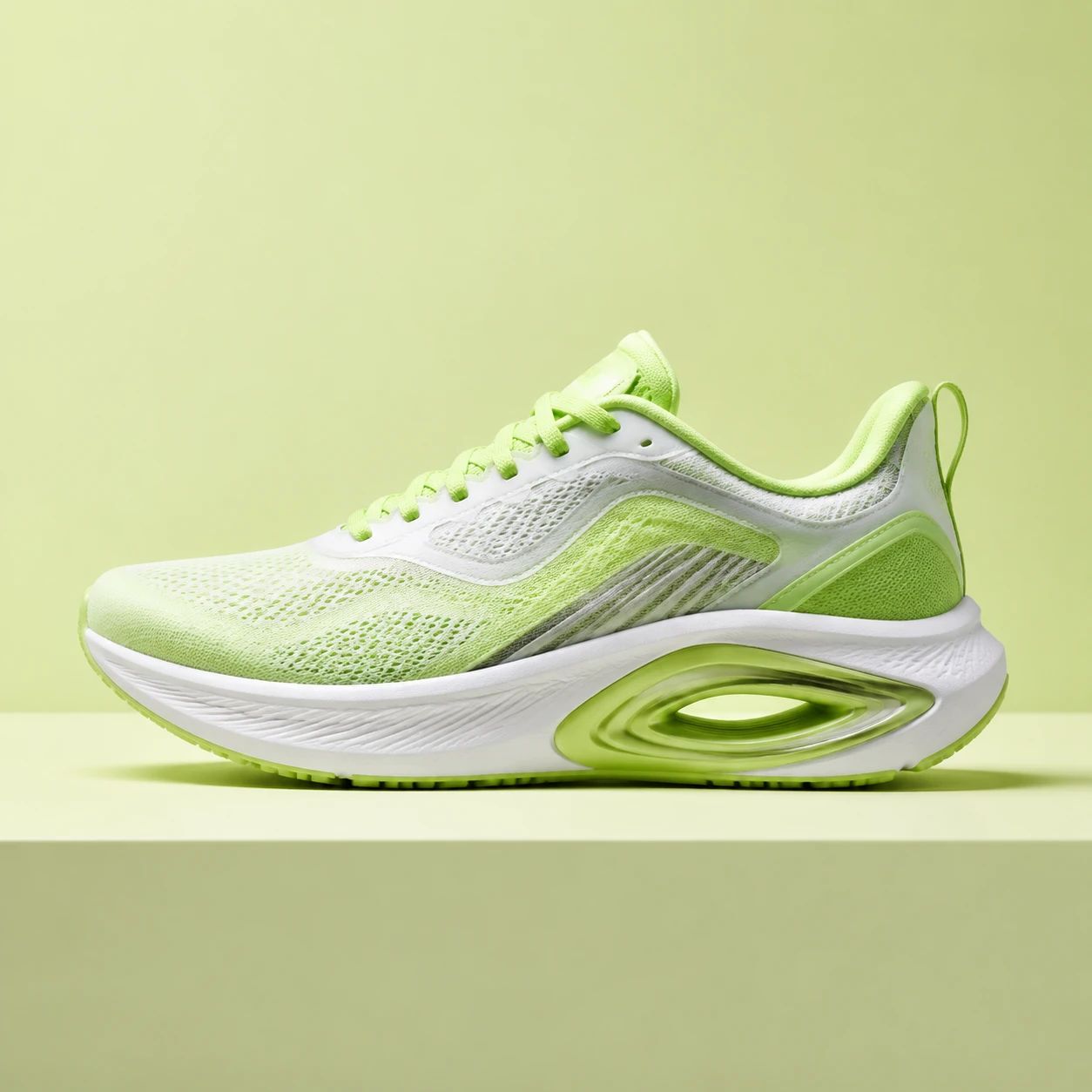
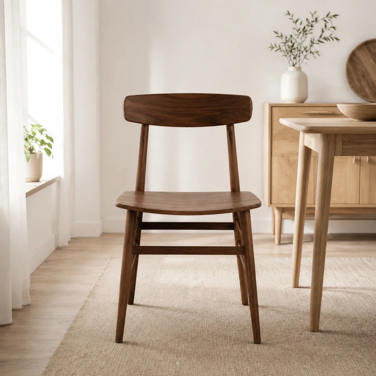
A shadow can help an isolated item look connected to the space around it, which may make a listing or campaign image feel more composed. It should support the item's silhouette and page layout, not compete with visible labels, material detail, pricing information, or the merchandise itself. Review the finished image in context before publishing.
What image works best?
+
Start with a source image where the complete item outline is visible and essential details such as labels, seams, texture, and packaging are reasonably clear. A simple background is often easier to assess, but the key factor is having enough information to judge whether the generated shadow sits naturally with the item's shape and intended placement.
Can I use the result for ecommerce?
+
You can consider the result for ecommerce after checking it against the requirements of the specific store, marketplace, or campaign channel. Review the actual crop, background rules, merchandise visibility, and category-specific image guidelines. The final selection should also look consistent beside other listing images rather than only when viewed on its own.
What should I check before publishing?
+
Inspect the item outline first, then check whether the shadow's density and direction make sense for the composition. Look closely at labels, text, corners, transparent areas, reflective finishes, and the space around the item. Finally, view the image at the destination size to make sure the treatment still supports clear merchandise evaluation.
Does every item need a strong shadow?
+
No. The appropriate amount of depth depends on the item, its background, and the surrounding design. Small packaged goods, listings with dense label information, and clean marketplace cards often benefit from a lighter treatment. Choose the result that helps the item feel placed while preserving a calm composition and keeping the shopper's attention on visible details.
How should I review shadows across a collection?
+
Compare several items together in the same grid or catalog layout instead of approving one image in isolation. Look for a consistent visual weight, enough space around each item, and shadows that do not vary so much that the collection feels assembled from unrelated shoots. Keep color, materials, and proportions clear for comparison.
What should I do with reflective or transparent items?
+
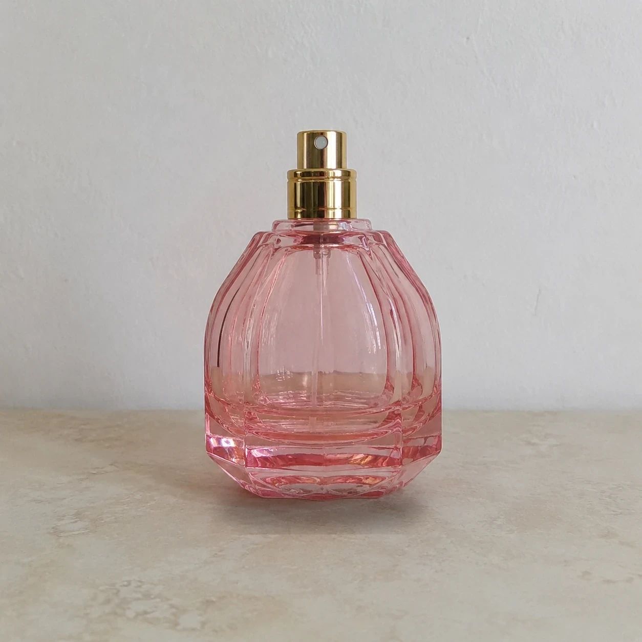
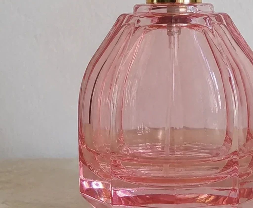
Give reflective glass, glossy packaging, and transparent items extra review time. Pay attention to the boundary where the shadow meets the item, as well as visible highlights, label edges, and transparent sections. Select a version that keeps the material believable in the composition and does not obscure information shoppers need to inspect.
Can item shadows support campaign design?
+
Yes, a considered shadow can give a campaign item crop a clearer sense of placement against colored backgrounds, text blocks, and other design elements. Review the image with the actual campaign layout, including the headline, offer, and responsive crops. The item should remain legible and visually central across the placements you intend to use.
How do I keep the final image aligned with my brand style?
+
Use the visual conventions established by your store, catalog, and campaign system as the reference point. Compare shadow strength, background spacing, crop, and overall mood with approved assets. A consistent approach can make a collection feel more cohesive, but each final image still deserves review for accurate representation and clear presentation.
Why should I view the result at its final size?
+
A shadow that looks appropriate in a large preview can appear heavier, softer, or less distinct in a small mobile card or marketplace thumbnail. Viewing the image at the final destination size helps you judge whether the item outline, labels, and spacing remain clear. It also reveals whether the shadow improves the composition or becomes unnecessary visual detail.