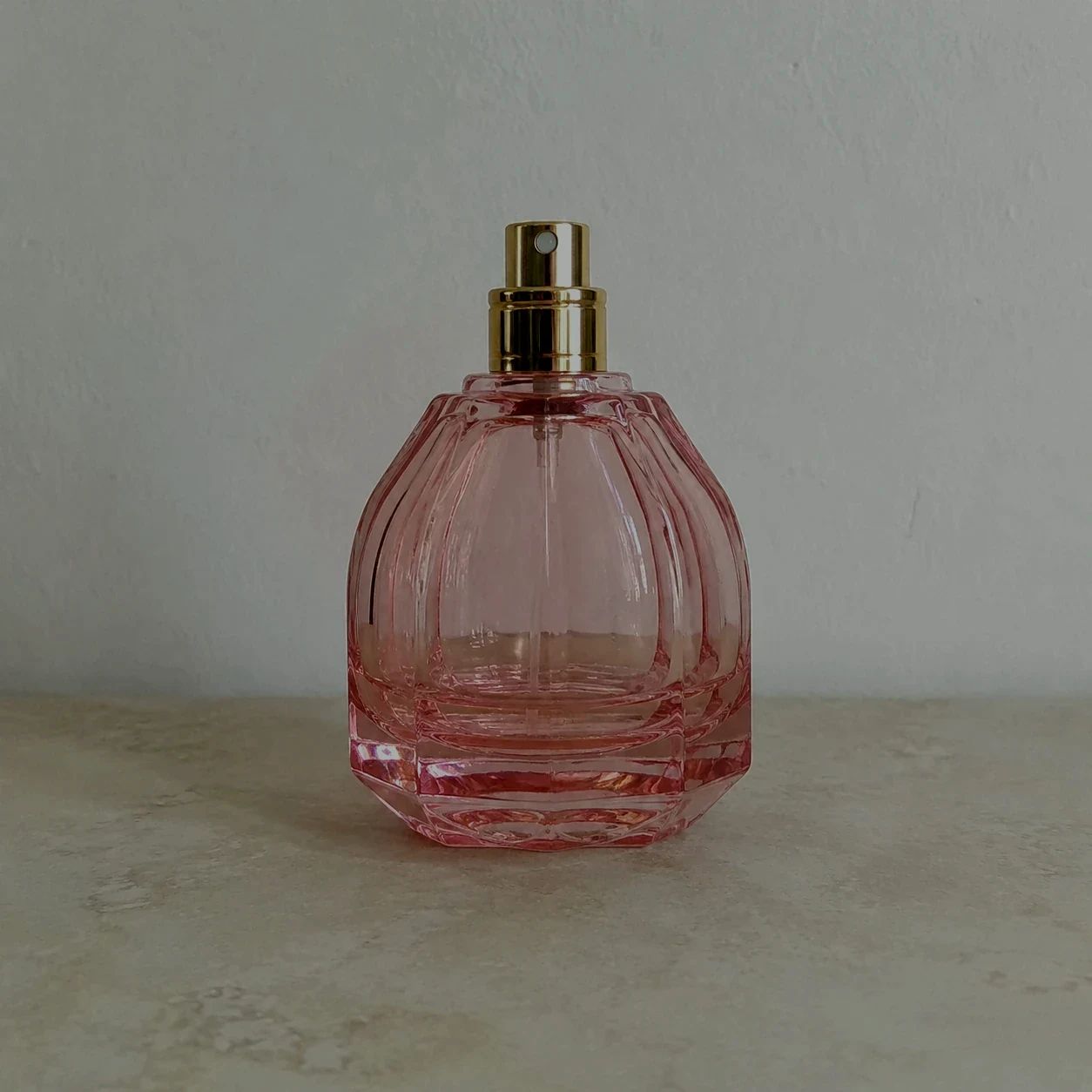
元のライティング
改善が必要な商品画像から始めます。
より鮮明な商業用商品写真
平坦または不均一な商品のライティングを調整し、商品の形状、素材、主要なディテールを見やすくします。
商品画像をアップロードしてライティングを最適化し、最終的なディテールを確認します。
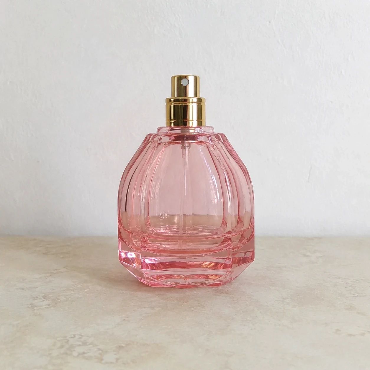
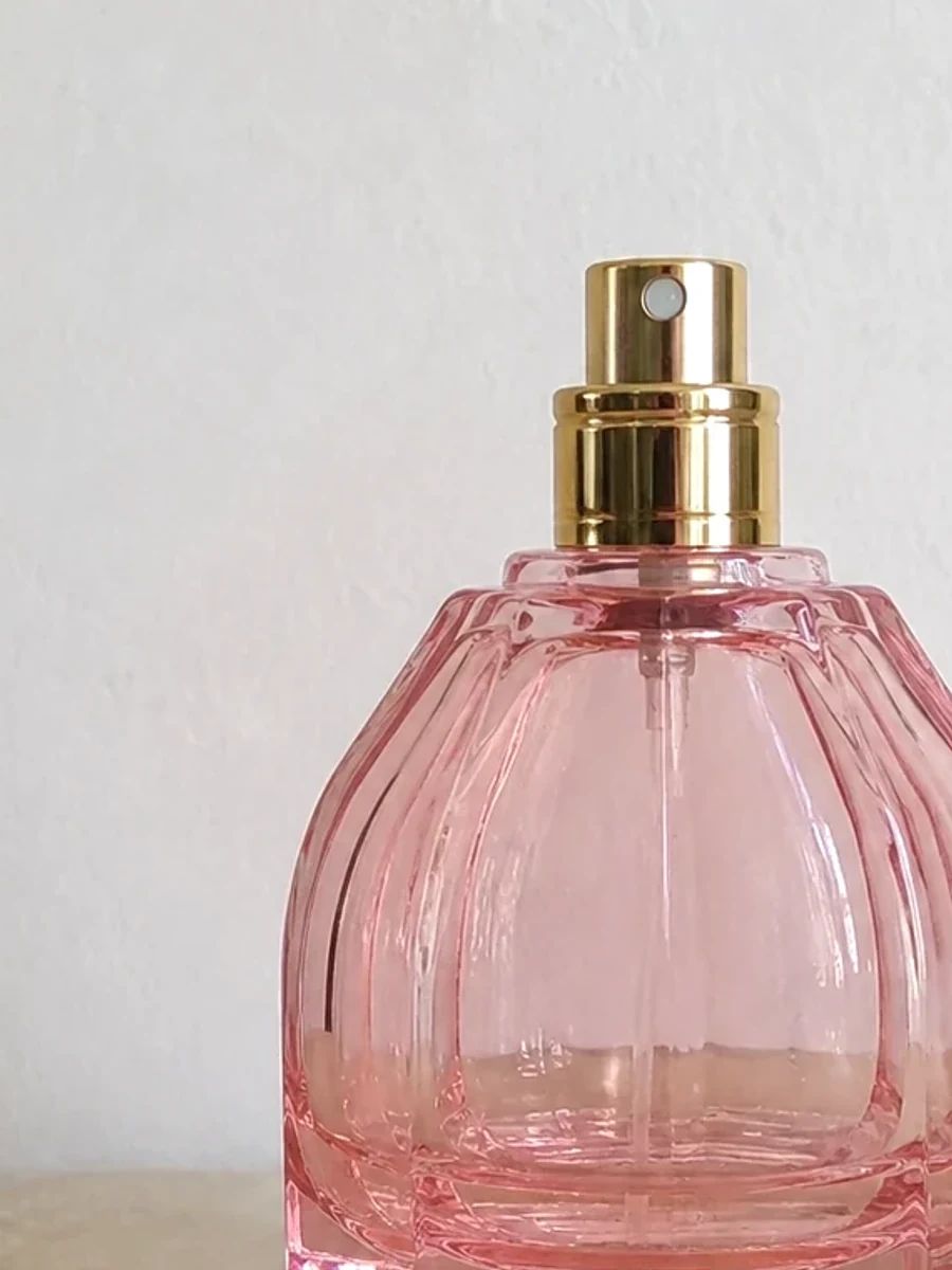
ライティングの例
Product Lighting Optimizer は、e コマース プレゼンテーションのフォーム、色、マテリアル定義に基づいて照明のバランスを取ることができます。これらの例は、実際の表示サイズで商品を人為的に劇的に見せることなく、詳細ページ、カテゴリ グリッド、プロモーション モジュール、キャンペーン クロップにわたる読みやすい処理に焦点を当てています。
改善が必要な商品画像から始めます。
洗練された光で、より鮮明な商品プレゼンテーションを作成します。
形状や表面の質感に注目を集めます。
コマース向けに、より洗練された商品画像を用意します。
ユースケース
既存のカタログ写真が次のチャンネルの表示サイズでうまく読み取れない場合は、照明調整を使用します。目的は、公開前にサムネイル、詳細ページ、キャンペーン レイアウトでハイライト、シャドウ、ラベル、仕上げ、承認済みの色を読みやすい状態に保ちながら、コレクション全体で一貫した処理を行うことです。個別のプレビューだけでなく、実際の店頭シェルで明るい部分と暗い部分を比較します。バランスの取れた照明により、買い物客のラベル情報や素材の質感をマスキングすることなくコレクションの一貫性が保たれるためです。
購入者が素材、色、商品の形状を確認しやすくします。
さまざまなソースの写真に、より一貫したライティングの方向性を持たせます。
広告、ローンチクリエイティブ、SNS投稿用に洗練された商品アセットを用意します。
ソース写真から始めて、Product Lighting Optimizer を使用し、それが使用されるチャネルに対して結果を確認します。この比較が重要なのは、効果的な e コマース画像は、人々が商品の色、素材、形状、および意図されたコンテキストで目に見える詳細を理解するのに役立つ必要があるためです。
ライティングの調整が必要な、鮮明な元の写真を選択してください。
より明るく、バランスの取れた商業的な外観を生成します。
画像を使用する前に、色、ハイライト、質感、ラベルを確認してください。
商品のディテールに特化
照明の改良を使用して、明確な商用構成内でアイテムを評価しやすくします。最終的な画像は、商品の実際の内容から気をそらす劇的な効果に依存するのではなく、元の主題、その目に見える詳細、および代替品と比較する買い物客の能力をサポートするものでなければなりません。
01
平坦または不均一なライティングを調整し、より鮮明な商品写真にします。
02
表面のディテールや商品の形状により注目を集めます。
03
ストアフロントやキャンペーンのレイアウトに合わせて、より一貫性のある画像を用意します。
商品カテゴリー
素材、色、シルエット、パッケージを明確に伝える必要がある場合は、照明の改良を使用します。カテゴリが異なれば、異なるチェックが必要になります。反射ボトル、テクスチャード加工の靴、食品パッケージ、電子機器にはそれぞれ、最終的なカタログ画像で読み取れるようにしておかなければならない重要な視覚的詳細が含まれています。
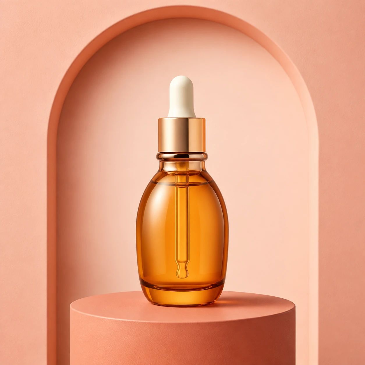
洗練された商品写真で、パッケージや仕上がりを明確にします。
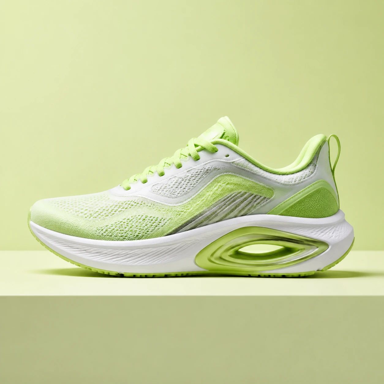
商品比較のために、形状、質感、色を明らかにします。
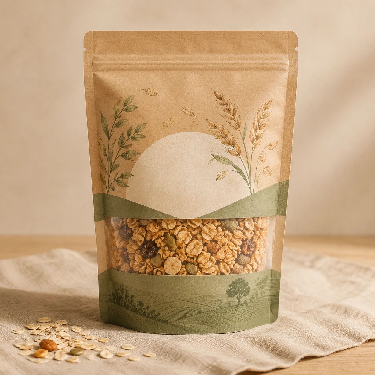
商品のパッケージや盛り付けのディテールを見やすくします。
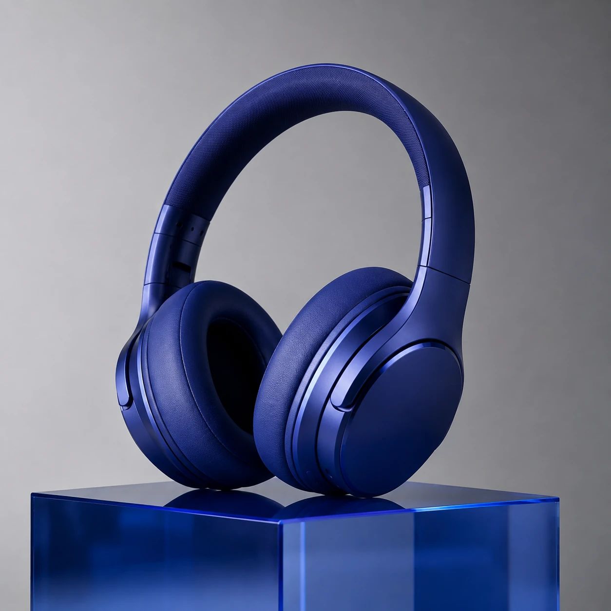
制御されたハイライトで、形状と素材を表現します。
e コマースの写真撮影、カタログの準備、キャンペーン制作で製品ライティング オプティマイザーを使用するチーム向けの実践的な回答。
露出とライティングを調整し、商品の形状、素材、ディテールをより鮮明にするのに役立ちます。
アイテムが見えており、重要なディテールが適度に鮮明な元の画像を使用してください。
はい。公開する前に、商品の色、ラベル、ハイライト、質感を確認してください。
ストア、マーケットプレイス、またはキャンペーンチャネルの画像ルールに従って、最終的な画像を確認してください。
元画像と結果を比較し、商品の色、素材、ハイライト、影、ラベル、形状が意図どおりに見えるか確認してください。実際の掲載サイズでも判断します。
はい。元画像を参照として保管し、結果の照明や色の変化を確認できるようにしてください。
商品全体と重要なディテールが見える、十分に明瞭な写真を使用してください。強いぼけや極端な切り抜きは確認を難しくします。
いいえ。照明の調整結果は候補です。ブランドや販売先の要件と実際の画像を担当者が確認してから使用してください。
保証されません。光の変化で色、反射、質感の見え方が変わることがあるため、元画像と照合し、重要な商品情報を確認してください。
用途によってトリミングや表示サイズが異なります。各配置で照明、コントラスト、商品の視認性を確認し、必要に応じて別の結果を選んでください。
商品写真を最適化して、より鮮明な露出、素材の質感の向上、洗練された商用レベルの仕上がりを実現します。
元の写真から始めて、商品の重要なディテールをすべて確認してください。