
Hautpflege
Ein professioneller weißer Hintergrund für Produktdetailseiten.
Saubere Bilder für jeden Kanal
Verleihen Sie Produktfotos, Porträts und Logos eine saubere weiße Umgebung, ohne ein neues Shooting zu organisieren.
Laden Sie ein Bild hoch. Generieren Sie einen sauberen weißen Hintergrund. Überprüfen Sie das Ergebnis.
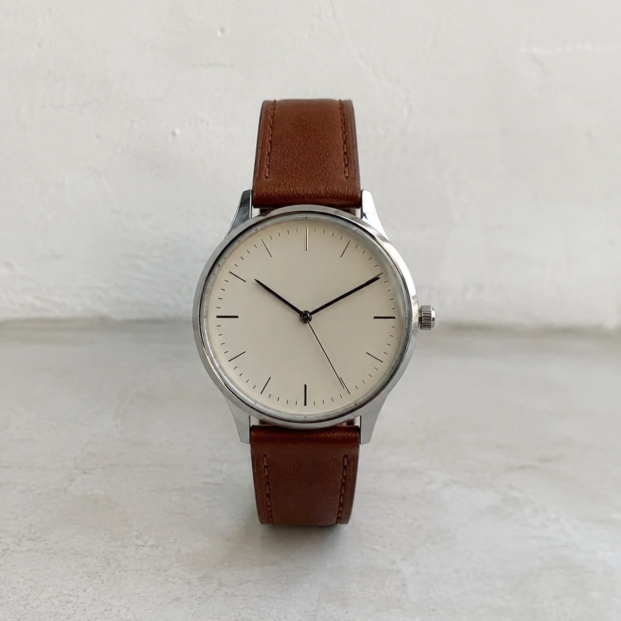
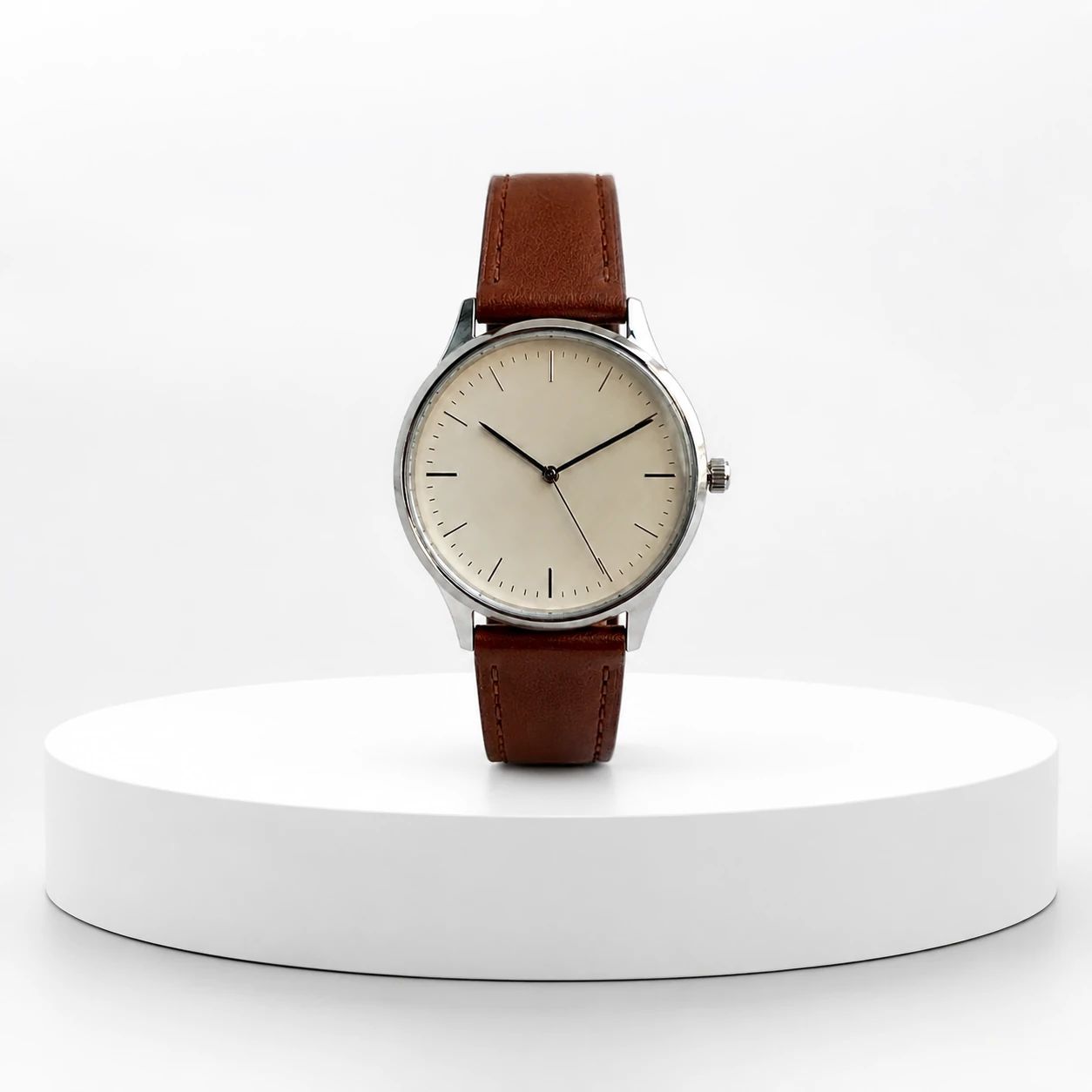
Beispiele für weißen Hintergrund
Ein weißer Hintergrund kann die Untersuchung eines Gegenstands, Gesichts, Symbols oder Dokuments erleichtern, da die umgebende Szene weniger Aufmerksamkeit erfordert. In den verfügbaren Beispielen werden Produkte verwendet, um die Kanten- und Abstandsprüfung zu veranschaulichen, aber derselbe Prozess gilt auch allgemeiner: Vergleichen Sie das erzeugte Bild mit seiner Quelle und beurteilen Sie dann, ob das Motiv für den vorgesehenen Bestimmungsort genau und lesbar bleibt.
Ein professioneller weißer Hintergrund für Produktdetailseiten.
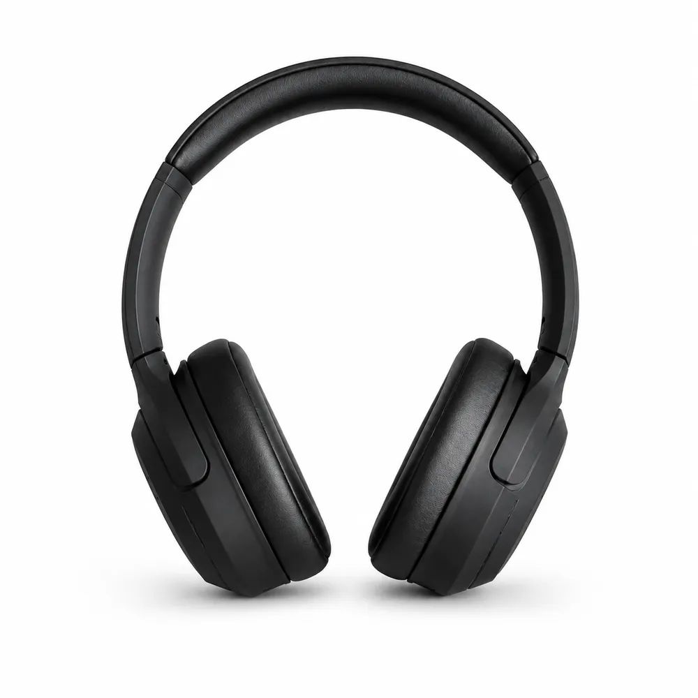
Ein ablenkungsfreies Bild für Elektronik-Angebote.
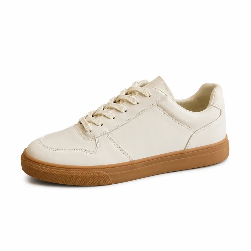
Eine klare Katalogpräsentation für Schuhe.
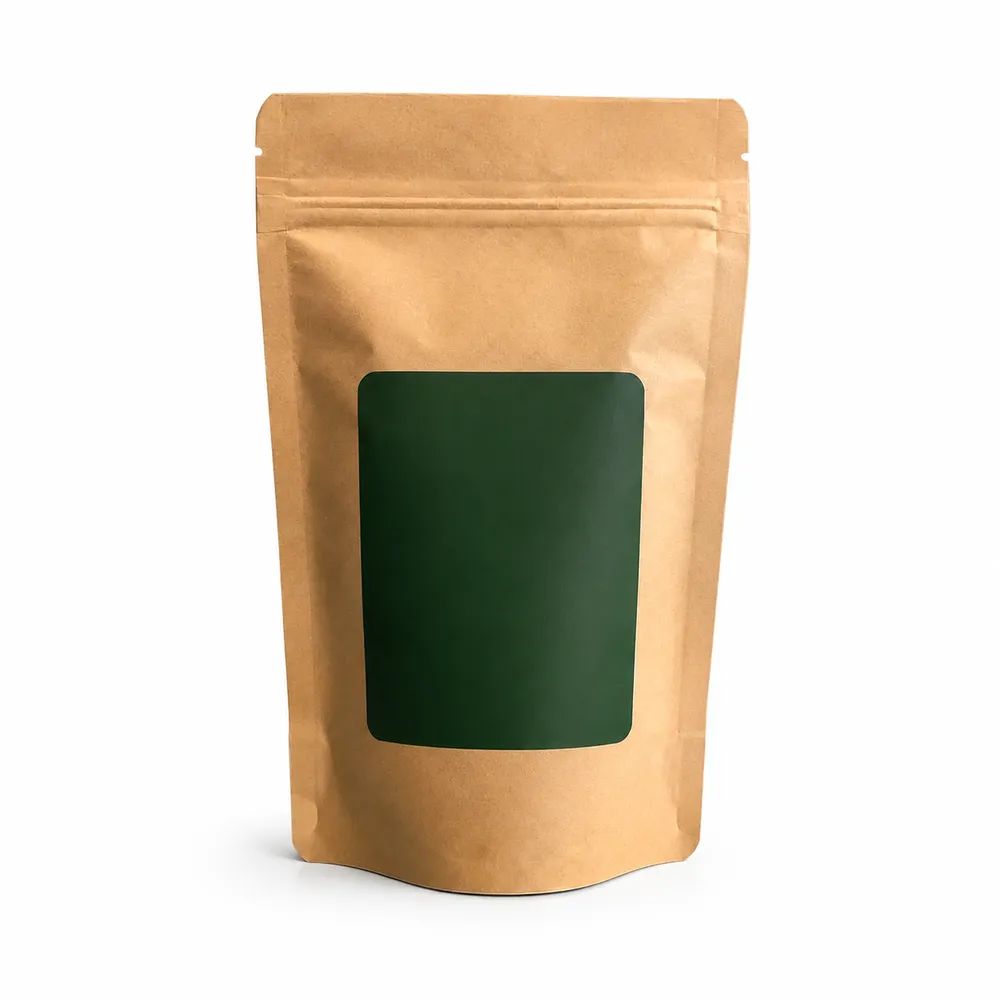
Eine einfache weiße Szene für Alltagswaren.
Anwendungsfälle
Ein Weißhintergrundgenerator ist immer dann nützlich, wenn ein Motiv eine ruhigere, gleichmäßigere Einstellung benötigt. Es kann eine Produktreferenz, ein Mitarbeiterporträt, einen Logo-Proof, ein gescanntes Dokument oder einen gewöhnlichen Objektdatensatz unterstützen. Wählen Sie zuerst das Ziel aus, da ein Schaufenster, ein Profil, eine Präsentation, ein Archiv und ein internes System unterschiedliche Zuschnitte, Ränder, Kontraste oder Überprüfungskriterien erfordern können.
Bereiten Sie klare Produktfotos für Handelskanäle vor.
Erstellen Sie einen konsistenten, aufgeräumten Porträthintergrund.
Platzieren Sie eine Marke auf einem sauberen Hintergrund für eine flexible Nutzung.
Beginnen Sie mit einer Quelle, die Ihnen genügend Informationen zum Vergleich nach der Generierung bietet. Ein klarer Betreff und ein bekanntes Ziel machen den Workflow mit weißem Hintergrund nützlicher, aber die Generierung ist immer noch ein Produktionsschritt und keine endgültige Genehmigung. Überprüfen Sie das Bild in Arbeitsgröße und im endgültigen Zuschnitt, mit der Quelle als Referenz in der Nähe.
Wählen Sie ein Produkt, Porträt oder Logo mit einem sichtbaren Motiv aus.
Nutzen Sie den Generator für weißen Hintergrund, um die neue Umgebung zu erstellen.
Überprüfen Sie Kanten, Farben und wichtige Beschriftungen vor der Verwendung.
Sauberer visueller Output
Verwenden Sie den White Background Generator, um konkurrierende visuelle Informationen rund um ein Thema zu reduzieren und eine einheitlichere Präsentation zu erstellen. Die Ausgabe ist ein Ausgangspunkt für kommerzielle Arbeiten, Profile, Dokumentation, Entwurfsprüfung oder interne Organisation; Die endgültige Eignung hängt von Ihrer Prüfung der Quelle, des Ergebnisses und des Ziels ab.
01
Reduzieren Sie visuelles Rauschen um den Artikel in Katalogbildern.
02
Richten Sie verwandte Produktbilder an einer gemeinsamen neutralen Umgebung aus.
03
Prüfen Sie das Ergebnis, bevor Sie es in einem Verkaufskanal veröffentlichen.
Produktkategorien
Eine weiße Einstellung kann dazu führen, dass viele Arten von visuellen Aufnahmen kohärenter wirken, aber jedes Motiv weist Details auf, die eine genaue Betrachtung verdienen. Verwenden Sie das Quellbild als Referenz für Identität, Farbe, Text, Finish und Proportionen. Überprüfen Sie das Ergebnis auf der beabsichtigten Seite, im Profil, im Archiv oder im Layout, wo Kontrast und Maßstab leichter zu beurteilen sind.

Zeigen Sie Kosmetik und Hautpflege deutlich.
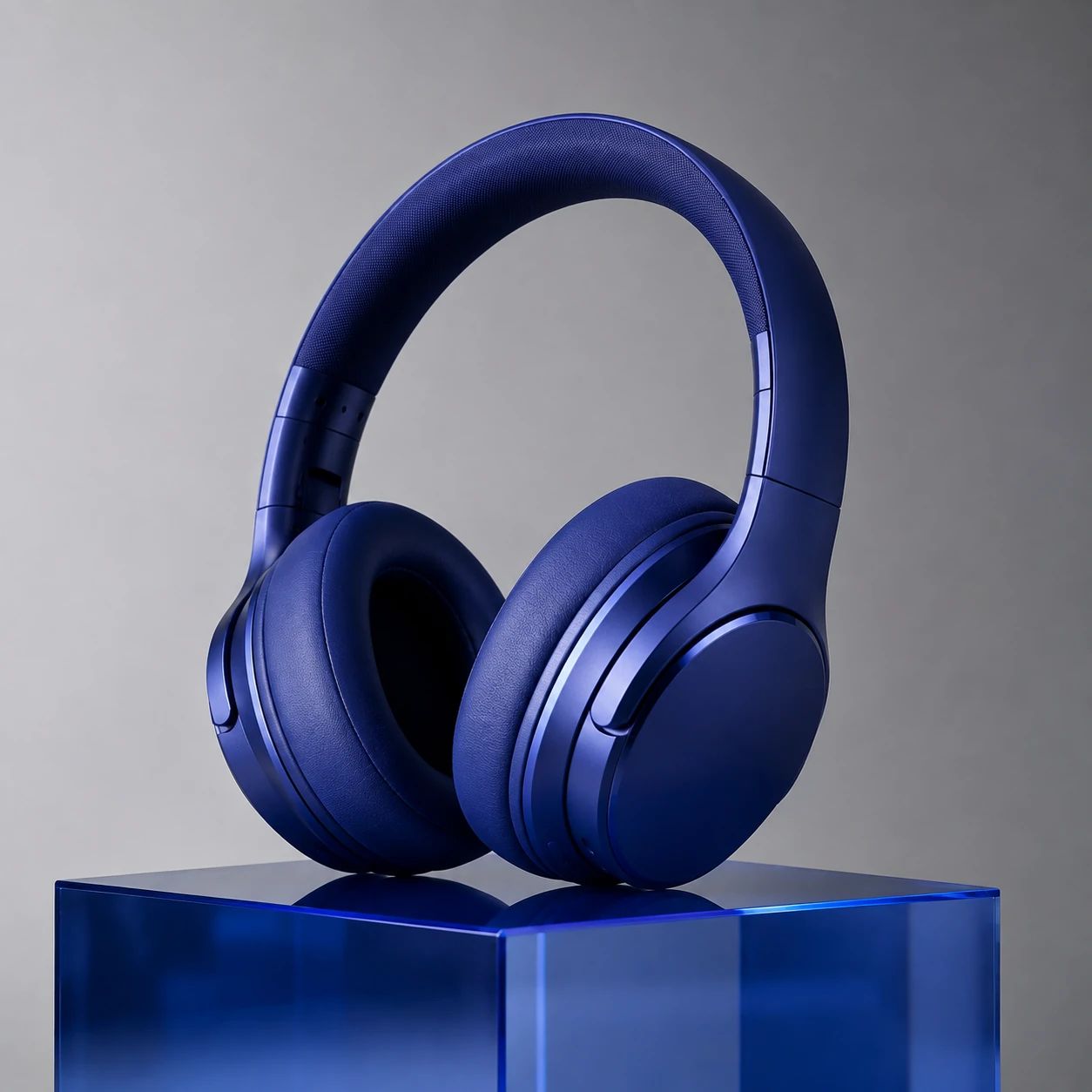
Halten Sie Gerätedetails leicht prüfbar.

Präsentieren Sie Form und Farbe ohne Ablenkung.

Erstellen Sie eine unkomplizierte Verpackungspräsentation.
Praktische Antworten zum Auswählen eines Quellbilds, zum Erstellen einer sauberen Weißeinstellung, zum Überprüfen von Details und zum Vorbereiten von Produktfotos oder anderen themenbezogenen Assets für den vorgesehenen Bestimmungsort.
Laden Sie ein klares Bild hoch, auf dem das Produkt, Porträt oder Logo sichtbar ist.
Nein. Ein weißer Hintergrund kann auch bei Porträts und Logo-Assets helfen.
Überprüfen Sie Motivkanten, Farben, Text und Plattformanforderungen.
Ein Bild mit weißem Hintergrund kann ein nützlicher Ausgangspunkt sein, doch ein Profil, Archiv, eine Präsentation, Shop-Kachel oder Kampagne kann unterschiedliche Beschnitte, Ränder, Auflösungen, Motivmaßstäbe oder Zusatzkontexte benötigen. Erstellen Sie getrennte Versionen, wenn sich das Ziel ändert.
Ein weißer Hintergrund kann einem Teamprofil, einer Biografie oder einem Präsentationsporträt eine ruhigere Umgebung geben. Vergleichen Sie das Ergebnis mit der Quelle auf Gesichtsidentität, Hautton, Haare, Brille, Kleidung und Schulterkanten. Nehmen Sie nicht an, dass ein erzeugtes Porträt Pass-, Visum- oder andere amtliche Ausweisstandards erfüllt.
Sie können eine weiße Umgebung nutzen, um ein Logo, Icon, Diagramm oder eine einfache Illustration auf neutralem Feld zu prüfen. Kontrollieren Sie dünne Linien, Innenräume, Transparenz, Schrift, Farbe und Freiraum anhand der genehmigten Quelle. Bewahren Sie Originalvektor oder Mastergrafik, wenn exakte Geometrie oder Markenfarbe wichtig sind.
Eine weiße Umgebung kann eine sauberere Präsentation für eine nicht sensible Quittung, Karte, Arbeitsblatt oder gedruckte Referenz schaffen, doch jedes Wort, jede Zahl, jeder Stempel, jede Unterschrift und jeder Rand muss mit der Quelle verglichen werden. Bewahren Sie die Originaldatei auf und verwenden Sie ein erzeugtes Ergebnis nicht als Beweis, amtlichen Datensatz oder Ersatz für einen offiziellen Scan.
Diese Motive benötigen genauere Prüfung, weil ihre Kanten mit der weißen Umgebung verschmelzen können. Prüfen Sie dünne Konturen, Glas, klaren Kunststoff, helle Stoffe, polierte Oberflächen, feine Haare und dezente Kontaktbereiche in größerer Ansicht. Wählen Sie eine andere Quelle oder ein anderes Ergebnis, wenn der Umriss unklar bleibt.
Achten Sie auf Schatten, die einem Objekt Bodenhaftung geben, ohne den Umriss zu verdecken oder die wahrgenommene Position, Form oder Größe zu verändern. Porträt, flache Grafik und dreidimensionales Objekt brauchen unterschiedliche Behandlung. Prüfen Sie dezente Schatten bei hellen, transparenten und reflektierenden Motiven in der endgültigen Größe.
Verlassen Sie sich nicht auf das Ergebnis, wenn es Identität, Text, Produktfakten, Messwerte, farbkritisches Material oder andere autoritative Details verändert. Es ist auch kein Ersatz für amtliche Identifikation, Beweismittel oder ein Originaldesign. Bewahren Sie die Quelle auf und nutzen Sie die passende Prüfung, wenn Genauigkeit rechtliche, kommerzielle oder dokumentarische Folgen hat.
Verwenden Sie den White Background Generator, um eine neutrale Einstellung für ein Produktfoto, Porträt, Logo oder Objektbild zu erstellen, vergleichen Sie es dann mit Ihrer Quelle und überprüfen Sie den endgültigen Ausschnitt, bevor Sie es in einem Katalog, einer Seite, einer Kampagne oder einem anderen Ziel verwenden.
Beginnen Sie mit einem klaren Bild.