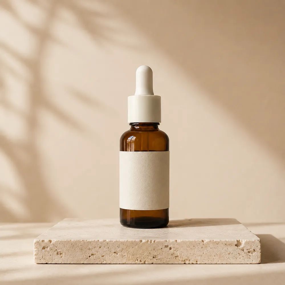
Skincare studio
Try a restrained studio palette for a polished product presentation. Review packaging shades, label readability, cap edges, reflected color, and skin-tone context if the image includes a hand or model.
A new backdrop palette for each image
Change a photo background color to explore a new palette for product images, campaigns, or simple compositions.
Upload a photo, describe the intended palette, generate, and inspect the result.
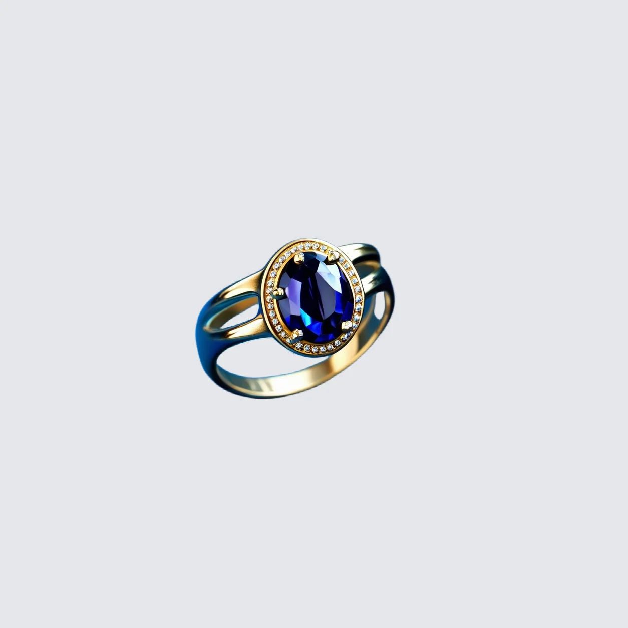

Color examples
Color can change the emphasis around a product, package, portrait, or object without requiring a new physical set. These examples are creative directions rather than fixed specifications. Compare each generated backdrop with the source image, brand system, and destination layout, then decide whether contrast, crop, spacing, and visible details are suitable for your use.
Try a restrained studio palette for a polished product presentation. Review packaging shades, label readability, cap edges, reflected color, and skin-tone context if the image includes a hand or model.

Use a backdrop treatment that creates separation around hardware, cables, pads, and finish. Check dark contours, glossy highlights, ports, and product scale at the final card or campaign crop.

Explore contrast around a sneaker's color, silhouette, laces, and sole while keeping the composition readable. Compare the result with the source so material, shape, and fine product details remain understandable.
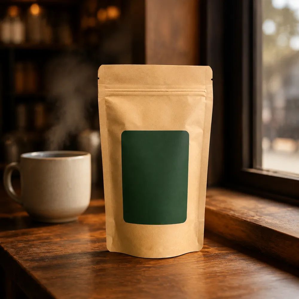
Set a warmer or quieter scene for a packaged item, then inspect the logo, flavor text, container outline, highlights, and crop. Test the option in the channel layout where the image will be shown.
Use cases
A Background Color Changer can help an image adopt a campaign, seasonal, editorial, or catalog palette. In product photography, the purpose is often to make the item easier to notice within a layout, not to make an isolated color promise. Plan the destination first: an ecommerce card, paid ad, social post, and product detail page can need different mood, spacing, and contrast.
Explore a background color treatment that works with your current creative system, then review the result beside existing campaign assets. Check how the item, typography, and surrounding layout read together before production use.
Refresh the backdrop palette for a launch, holiday, event, or limited collection without building a new scene. Compare the generated image with your source and review any product details that become less visible.
Use a colored setting to frame an item in a product page or campaign composition. Inspect product edges, material, labels, proportions, and final crop carefully rather than assuming the generated output is ready to publish.
Start with a source photo that clearly shows the subject, and decide what job the new backdrop needs to do before generating. Describe an overall palette or mood in your workflow, then treat the output as a version to review. Compare it with the source and with the layout where the image will appear.
Choose an image with the subject reasonably sharp and visible. Avoid severe blur, extremely small subjects, hidden edges, heavy glare, or an overly tight crop that makes it hard to compare the surrounding composition after generation.
State the mood you want, such as calm, bold, seasonal, minimal, or editorial, together with relevant color context. Use that request as a creative brief, then assess the generated version rather than relying on words alone.
Inspect contrast, subject edges, small text, packaging, material, reflections, and crop at the intended display size. Compare with the source and confirm the requirements of your brand, marketplace, publisher, or internal approval process before publishing.
Creative backdrop palettes
Use the Background Color Changer to explore a colored backdrop as part of a wider composition, then evaluate how it changes emphasis around the product. This is a creative image-production step, not a promise about a particular color outcome, product accuracy, or destination approval. Final suitability depends on your own comparison of the source, result, and intended channel.
01
Use a background color change to explore how a product sits within a campaign concept. Review the final composition alongside existing creative, checking contrast, product scale, label readability, and open space for any required layout elements or campaign copy placement.
02
Try a backdrop palette that helps product form, material, and important details read more clearly in a card or detail page. Inspect outlines, reflections, text, and small components at the final display size before selecting an image for publishing online.
03
Create alternate backdrop treatments for a seasonal set or product campaign without treating one generated image as final by default. Compare versions together for spacing, visual weight, product clarity, and consistency with the wider collection before use in live channels.
Product categories
A considered palette can support many kinds of product imagery, but category-specific detail still matters. Keep the source photo available for comparison, especially where labels, finish, color, or scale affect a purchase decision. Review the generated image in the destination layout, where the relationship between product, background, and surrounding content becomes clearer.

Explore a studio backdrop palette around packaging and cosmetics, then inspect shade, label text, cap edges, reflected color, and collection consistency. Review close crops and the product grid before choosing a final asset.

Use a colored background to frame device form, controls, ports, and material. Check dark or glossy contours, reflections, small markings, and product scale at the actual display size used by the destination.
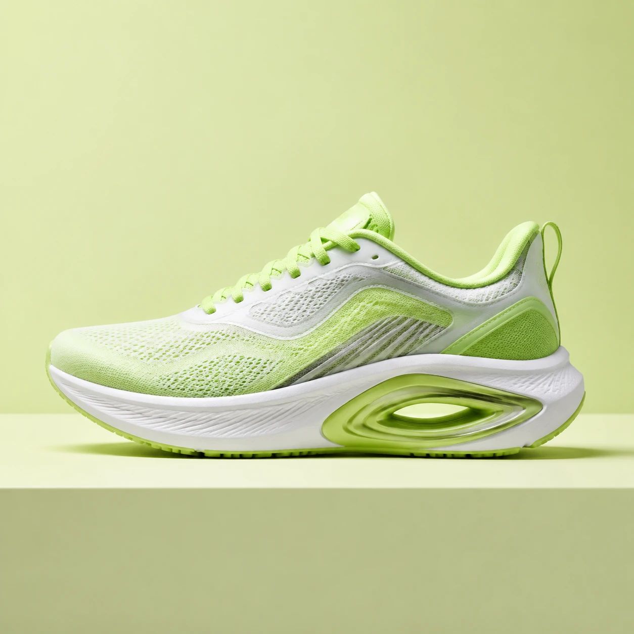
Try a campaign composition around footwear or apparel, then review silhouette, color, texture, laces, soles, folds, and crop. Compare related assets together so the backdrop does not overwhelm product clarity.
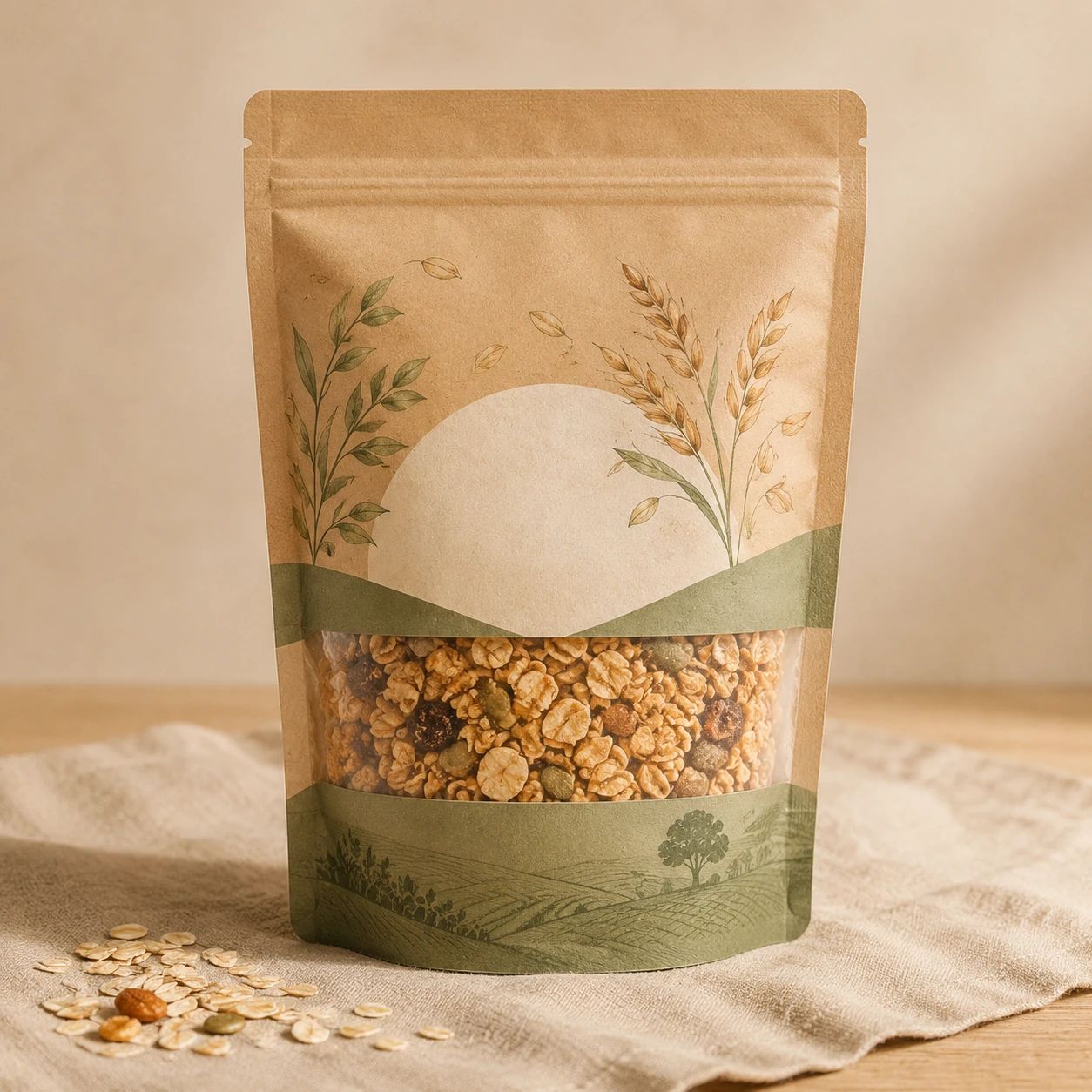
Set an appropriate backdrop treatment for a package or beverage image, then inspect brand marks, flavor text, container shape, highlights, and shelf-readability. Use the source image to verify important visual information before publication.
Practical answers for choosing a source image, setting a backdrop palette, reviewing a changed backdrop, and preparing product or campaign imagery for its intended layout and approval process.
A background color changer helps you explore a new backdrop treatment around a photo's subject. It can support product imagery, campaign concepts, social assets, portraits, or simple object compositions. Treat the generated image as a version to review against the source and intended layout. Check product details, contrast, crop, and visual hierarchy before using it in a live channel.
Begin with the job the image needs to do: product comparison, campaign mood, seasonal promotion, editorial context, or a simple clean presentation. Look at existing brand assets, surrounding typography, and the destination layout. Then generate an option and review the actual result. A written request is only a starting point; contrast and readability should be judged from the image itself.
You can describe a broader mood, such as calm, bright, understated, energetic, seasonal, or editorial, when that better suits the creative brief. Include enough context about the destination and subject to guide the work. After generation, inspect whether the composition supports that mood while keeping product details, edges, text, and material understandable.
Do not treat a generated background as a guarantee of a precise color match. When a campaign needs tightly controlled color, compare the result with your approved references in the tools and conditions your team uses. Review the full composition as well as the backdrop, because contrast, lighting, display settings, and surrounding elements affect how a color is perceived.
Review every result against the source rather than assuming any part of the image will remain unchanged. Check the subject's edges, labels, small text, material, reflections, color, proportions, and visible accessories at working size and final display size. Use another result or a different source when an important product or subject detail is no longer clear enough for your purpose.
Yes, it can help product teams explore campaign or collection palettes without building a new physical backdrop for every idea. Keep the workflow product-first: compare the result with the source, inspect critical details, and test the final crop in the actual page, card, ad, or social layout. Do not publish until the item remains understandable and appropriately presented.
Compare the image with its source for subject edges, product labels, logos, small text, color, shape, proportions, material, reflections, and accessories. Check whether the backdrop competes with the subject or makes important details difficult to see. Then review the final crop and display size in the destination. Confirm any applicable brand, publisher, or channel requirements through your own process.
One version can be a useful starting point, but each channel may use different crop ratios, text overlays, product scales, margins, or display sizes. A marketplace card, store page, social post, and campaign banner can make the same backdrop feel very different. Create and review separate versions where necessary, and check the current requirements for every destination before publication.
Write a concise creative brief covering desired mood, product scale, crop, empty space, typography needs, and review criteria. Generate and compare multiple images as a set, using the source photo to check important product information. A collection-level review can reveal inconsistent contrast, visual weight, or spacing that is not apparent when a single asset is examined alone.
No. A background color change is a creative production action and does not establish marketplace approval, advertising compliance, trademark clearance, or any other legal or channel status. Check the current rules that apply to your destination and have the appropriate reviewer assess the finished asset. Keep responsibility for product accuracy, claims, and publishing decisions within your own process.
Use the Background Color Changer to explore a new palette for a product image, campaign asset, or simple composition, then compare the generated version with the source and review its crop, contrast, details, and fit for the destination before using it.
Start with one clear image and a practical creative brief.